Step 1: Configure a search widget
Administrators create and customize the in their Network MDM instance. When the configuration is saved, Network MDM generates the code that web developers can use to embed the search widget in the internal application. You can also add the widget to an application to use in the Network Portal.
Prerequisites
Ensure that you have completed the following tasks:
-
Sign the Authorized Data Use Agreement (ADUA)
Veeva OpenData is available to access using the Network widgets. Sign the Authorized Data Use Agreement (ADUA) if you are using Veeva OpenData in a third-party vendor application.
Note: This is not required if you are using the widget in a Network Portal application.
-
Enable single sign-on (SSO)
Ensure that SSO is configured for your Network MDM instance and that users are assigned to an SSO security policy. For more information, see Enable single sign-on (SSO).
Add a search widget
- In the Admin console, click Widgets & Portal > Network Widgets.
- Click Add Network Widget.
-
In the New Network Widget dialog, select Search Widget from the list.
Review the Note section and ensure that all appropriate agreements (ADUA) are complete if you will be downloading third-party or Veeva OpenData records.
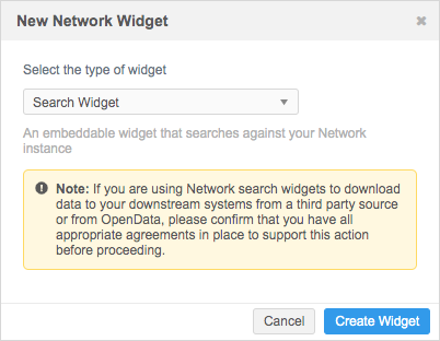
- Click Create Widget.
The New Search Widget page displays.
Details
Define the following information in this section.
- Name and Description.
-
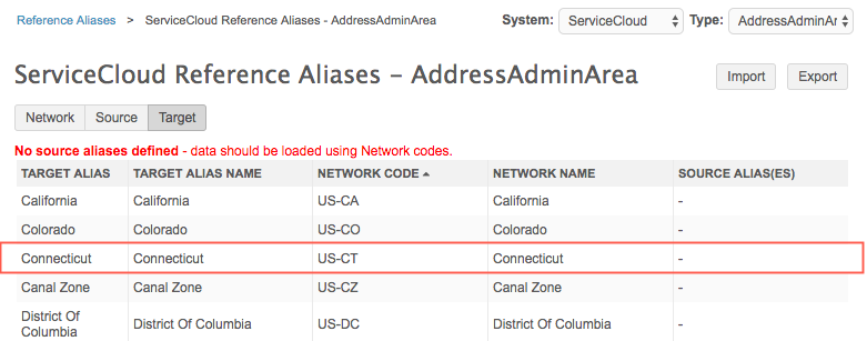
System - Select a source system.
A source system is defined for the following uses:
- Custom keys -Custom keys can be generated when users download a record using the . The system is used for the key, which enables you to export records for that system.
- Reference aliases - You can use the system's aliases (instead of Network MDM reference codes) in the JSON response returned for each search result. For example, Network MDM's address code for the state of Connecticut is US-CT. If a source system is defined, Network MDM returns the target reference alias value, Connecticut, instead of the Network MDM code. Using reference aliases avoids having to define custom mappings in the widget code; all of the mappings are done in your Network MDM instance.
To review the reference aliases for a source system, click System Interfaces > Reference Aliases. For more information, see Reference aliases.
- Type - Search Widget is selected by default.
- Widget Enabled - Choose Yes. The widget is not enabled by default.
General Settings
Define the domain and behavior for your widget.
-
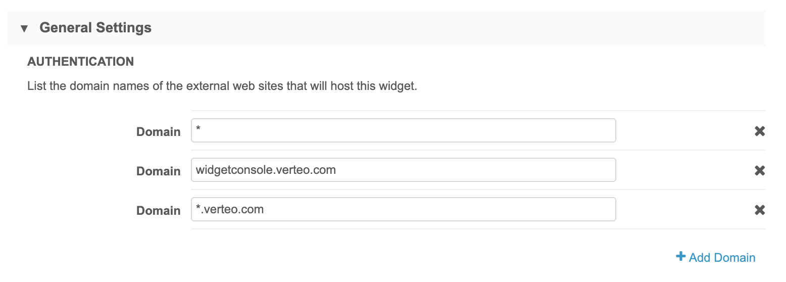
Authentication - Type the domain name for the internal website that will host the widget.
Multiple domain names can be added. Wildcards are supported in case the domain changes and to support multiple domains.
Click +Add Domain to specify additional domains.
Examples
-
Network Portal - If you are embedding the widget into the Network portal, use *.veevanetwork.com or your instance URL; for example, verteo.veevanetwork.com.
-
Salesforce - If you are embedding the widget into a Salesforce Visualforce™ page, use *.visual.force.com.
Hosting website requirements
Widget type Details Production widgets For security, the hosting website must use the HTTPS protocol. If the website does not use HTTPS, the widget cannot be accessed. Sandbox widgets These widgets can be hosted on websites that use the HTTP or HTTPS protocol.
Allowing HTTP for sandbox provides flexibility to developers to test the widgets on a local host server.Note: If developers are implementing the widgets using a local host server, add an asterisk (*) to the domain list in the widget.
-
-
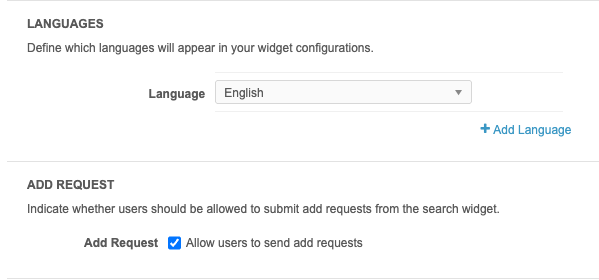
Languages - Add languages that should display in your . English is defined by default.
-
Add Request - The Allow users to send add requests option is enabled by default for new .
Clear the checkbox if you do not want add requests to be submitted from the widget.
About the add requests
When users create a record, an add request is submitted so data stewards can validate the data and create the record in Network MDM. The record is immediately available in your internal application so users can action it.
Add requests that are submitted using the will have the create_unverified flag set to true in the Change Request API. This API setting overrides the workflow setting for the request. So, if the Create Unverified workflow setting is not enabled in your Network MDM instance, the add request from the will still create an Under_Review record.
For more information, see Network MDM workflow considerations for add requests.
-
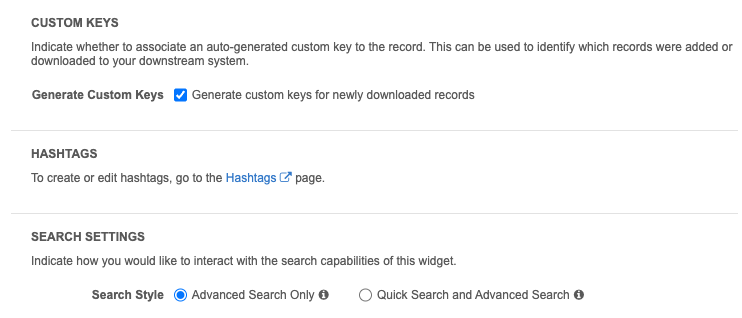
Custom Keys - The Generate Custom Keys option is enabled by default for new widgets. A custom key is automatically generated when a record is downloaded or added.
This helps you to track the systems that have downloaded records.
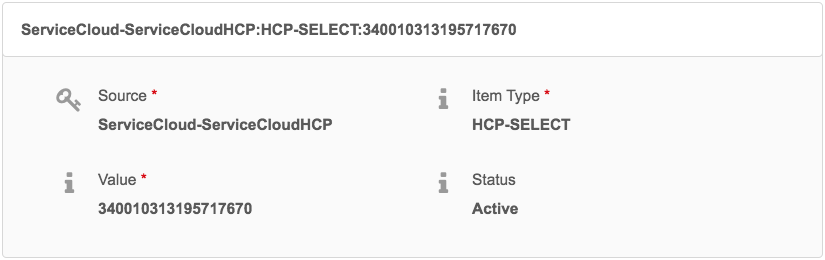
The custom key is created using the following format:
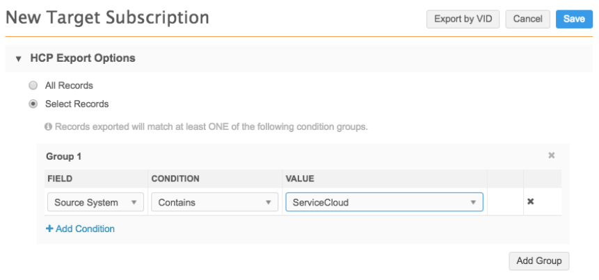
Source <SystemName>-<WidgetName> Item Type <EntityType>-SELECT Value The Network ID Using this information, you can configure a target subscription filter to export records added from the to your downstream system.
 Example: Target subscription
You can create a filter in your target subscription to export records that are downloaded to ServiceCloud™.
-
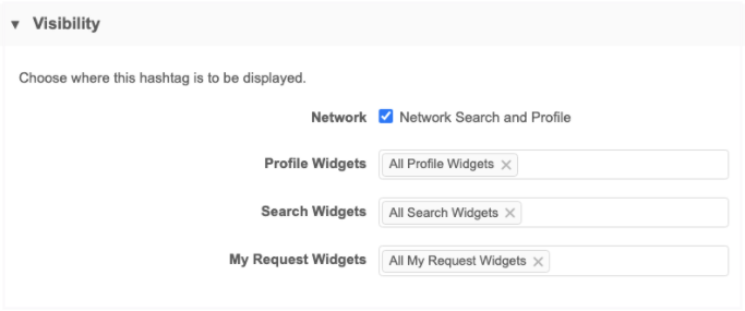
Hashtags - Network hashtags display in enabled by default. Hashtags are automatically applied to record profiles and search results to summarize important details on the record. They can also be used for search queries.
Click the Hashtags link to go to the Network Hashtags configuration. Open each hashtag and go to the Visibility section to set it to display for this widget.
-
Widget Header - Choose whether your widget should display a header.
By default, a header is not included so the widget displays seamlessly into your internal portal. If you include a header, you can add a custom logo and title in the Branding and Labels sections below.
Example: Header options
Widget with No Header Widget with Header 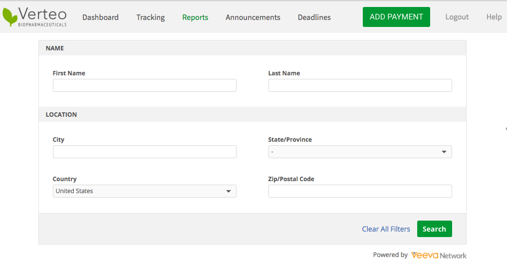
-
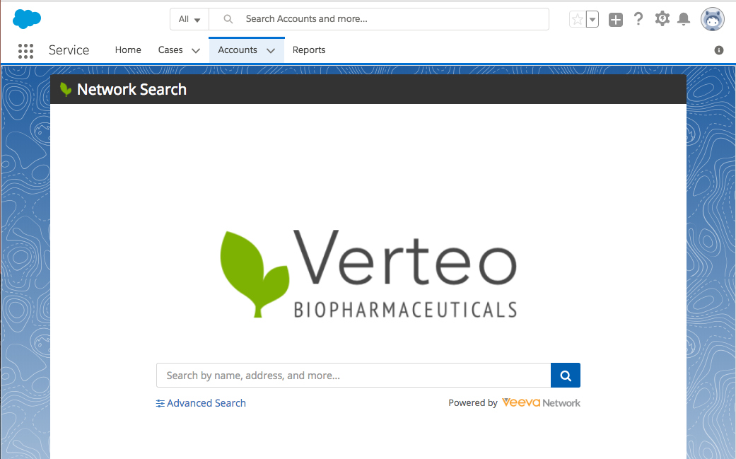
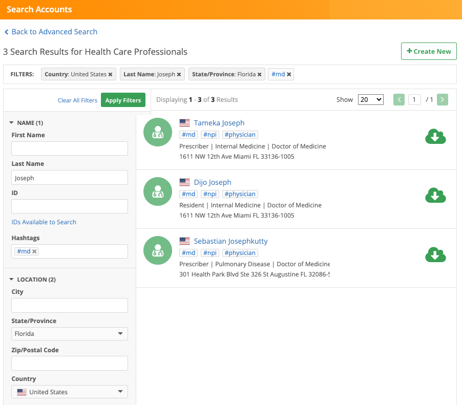
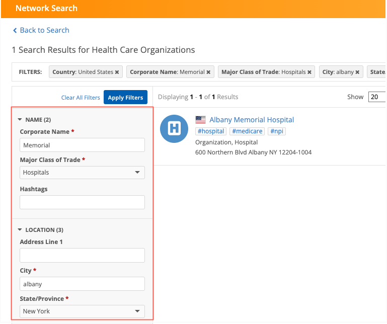
Search Settings - Choose the search style that will be presented to your users:
- Advanced Search Only - Users should always search using the advanced search form so they can search specific fields. Quick search is not available.
- Quick Search and Advanced Search - Users have the option of typing search terms into the quick search bar or using the advanced search form through the link.
Example: Search options
Advanced Search Only Quick Search and Advanced Search 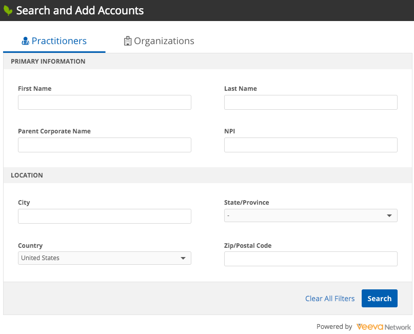

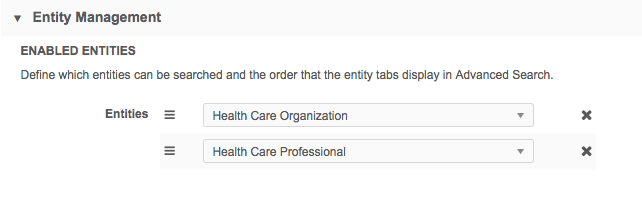
Entity Management
Choose the entities that users can search for with the widget.
By default, Health Care Organization and Health Care Professional are listed. For example, if you remove Health Care Organization, users will only see HCP records in their search results.
Use the handle  to reorder the entities; this determines the order of their tabs on the advanced search page.
Note: Records can also be filtered using preset filters as a property in the widget's HTML code. This gives you flexibility to configure one search widget, but use it in different areas in your internal application for different purposes. For more information, see Preset filters.
-
HCO and HCP tabs - Define the entity label that displays in each language supported by your .
By default, the labels are Health Care Organization and Health Care Professionals but, you might want to change the labels to Hospitals and Practitioners, respectively, depending on the terminology used by your users.
Quick Search - Displays if you enabled Quick Search in the Search Settings section.
-
Advanced Search Field Selection - Define the section labels and the fields that users can use for searching in the advanced search form.
By default, the HCO and HCP tabs include two sections with fields. One additional section can be added. Each section can include six fields.
The sections are designed to group similar fields. By default, the sections are grouped into the following categories:
- Section 1 - Name fields
- Section 2 - Location fields
- Section 3 - Other fields.
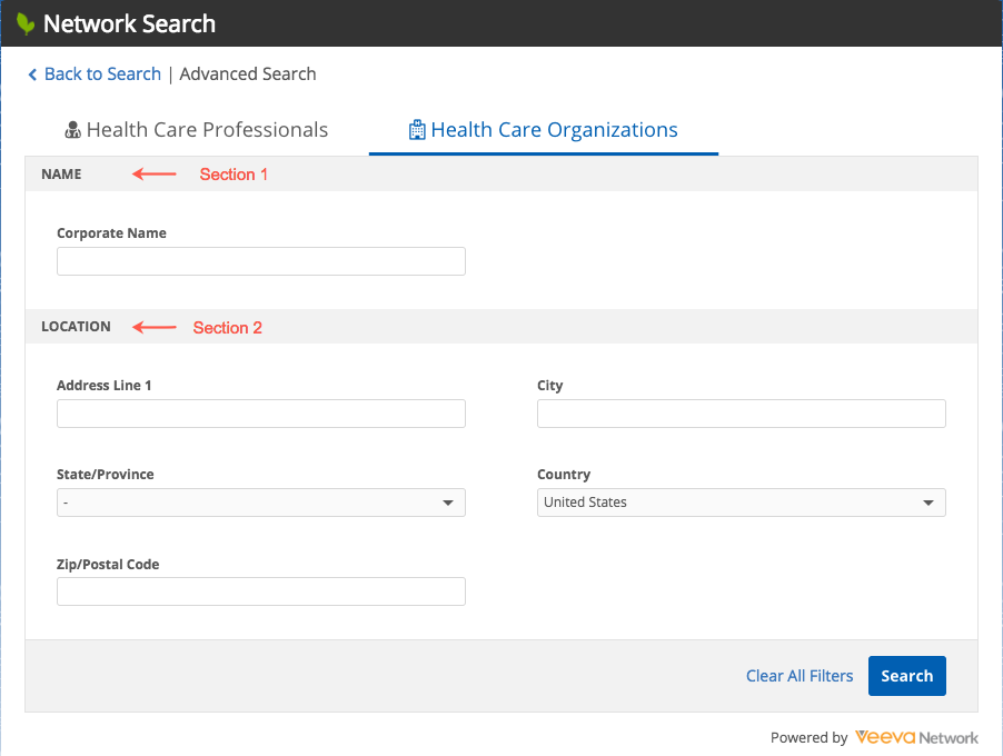
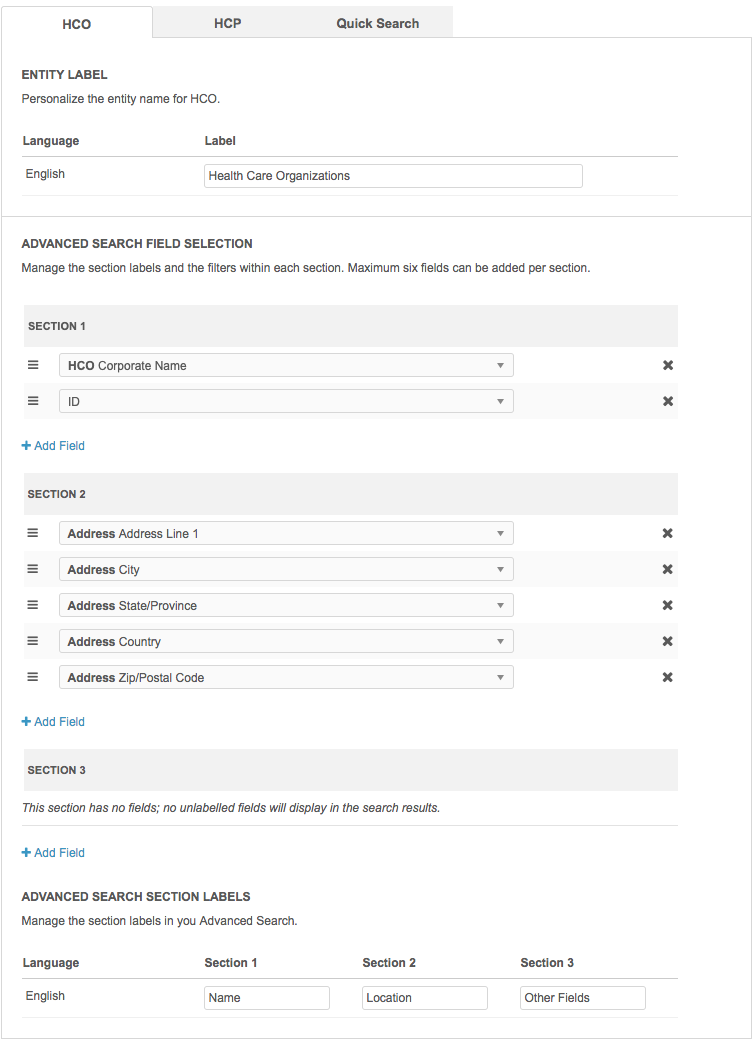 Example: Tabs, fields, and labels
In the default advanced search form, the Health Care Organizations tab has two sections with default fields.
Note: On the Quick Search tab, the sections represent the filters that can be used on the search results page to narrow the results.
Available actions for each section
-
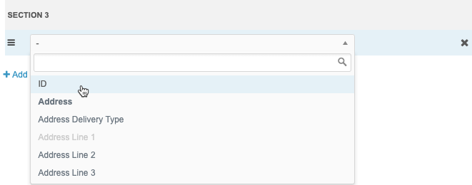
Add fields -Click + Add Field to define more filter fields; six fields can be included in each section.
Fields for all entities and sub-objects, except date fields, are available Other Fields and Name sections. The Location section includes address fields only.
Tip: Add the ID field to Section 1 or Section 3 so users can search by ID.
-
Required Field - Select to force users to define a value in the search form for the field. A red asterisk (*) will display beside the field.
The Save button on the search form will be dimmed until users have added a value for the required field.
All fields except Hashtags can be defined as required.
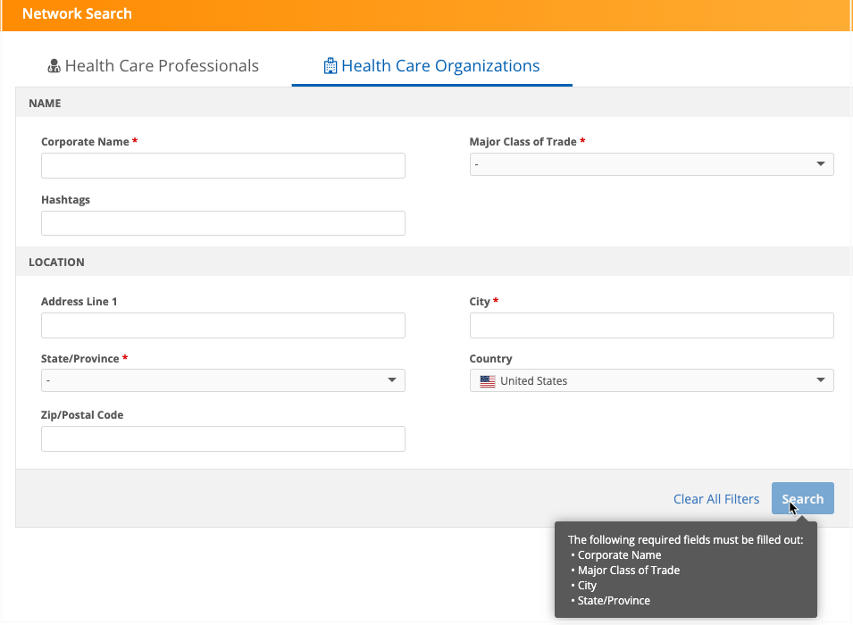
Note: Required fields are not supported for Quick Search.
The required fields also apply to the filters on the Search results page.
-
Default value - Specify a value that displays by default in the field so users do not have to add these values each time they search.
For example, if your widget users typically search for Hospitals, you can set Hospitals as the default value for the Major Class of Trade field. Users can accept the value or select a different value from the list.
Default values are supported for the Quick Search and Advanced search form.
Supported fields
-
Reference type fields
-
Boolean Checkbox fields
Reference type fields that are not supported
-
Address Country (
country__v) - The country field depends on the user's data visibility profile. -
Address Admin Area (
administrative_area__v) - The state or province depends on the selected country.
Considerations for default values
The field value in the Search form is empty in the following situations:
-
A default value is not defined.
-
The default value is not available to the user through their data visibility profile.
-
-
Limit Dropdown Items - Choose the values that are available for the field on the Advanced search form so widget users see only specific values.
For example, you can limit the limit the values for the HCP Type field to Prescriber and Non-Prescribing HCP so users don't see values like Dentist, Pharmacist, Student that are not relevant to them.
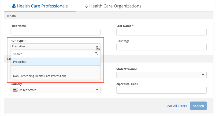
Limiting field values is supported for the Advanced search form.
Supported fields
-
Reference type fields
-
Boolean Checkbox fields
Reference type fields that are not supported
-
Address Country (
country__v) - The country field depends on the user's data visibility profile. -
Address Admin Area (
administrative_area__v) - The state or province depends on the selected country.
-
- Remove fields - Click the "x" icon beside the field.
- Reorder fields - Use the handle beside the field name and move it to another position in the list. The order defined here determines the order in the .
Tip: You can configure field and object settings on custom profile layouts to simplify add and change requests submitted through Network MDM widgets. For details, see Widget profile layouts.
-
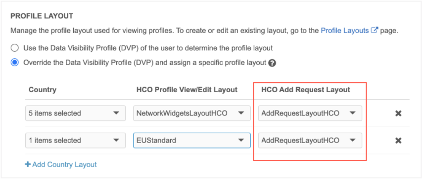
Profile layout - Choose how record profiles will display in the widget:
- Use the Data Visibility Profile of the user - This is the default option. The user's data visibility profile (DVP) typically contains all of the fields for the record.
-
Override the DVP and assign a specific profile layout - Specify a different profile layout for record profiles and add requests. For example, for the Profile View/Edit Layout you might create a layout that contains only the fields that are essential for your business purposes.
The Add Request Layout can be different than record profiles and change requests. This gives you more flexibility over the forms that display for users. Using a limited profile layout can generate better add requests because you can include only the fields that are essential for creating a new record.
All of the standard and custom profile layouts in your Network MDM instance display.
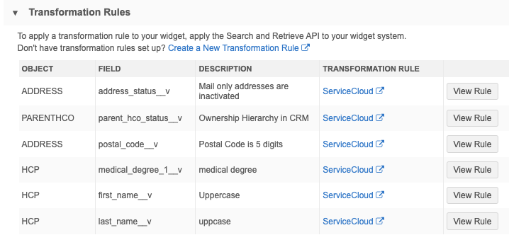
Transformation Rules
Rules can be applied to transform the data that users download from the widget. The transformed data will display in the downstream system.
For details, see Apply transformation rules to Network widgets.
Example
You can limit the addresses that display on records in downstream systems.
Rules that have been applied to the system that the widget uses displays in this section.
-
To create a rule, click Create a New Transformation Rule to open the Transformation Rules page.
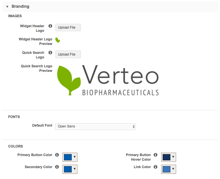
Branding
Customize the style of the widget.
To understand how these style settings map to the widget, review Example 1 and Example 2 below.
-
Images - Upload any logos that you want to add to the widget.
Image files in .JPG and .PNG formats are supported. The image name cannot contain spaces. The image file will be automatically resized to fit in the appropriate space.
- Widget Header Logo - Logo for the widget header (maximum height and width is 24px by 24px).
- Quick Search Logo -Logo on the quick search widget page if you have chosen it in the search settings (maximum height and width is 120px by 380px).
Uploaded images display in the Preview section.
- Font - The font family used in the widget. By default, Open Sans is selected.
- Colors - Customize the colors for your widget.
- Primary Button Color: Default, #005FB2
- Primary Button Hover Color: Default, #16325C
- Secondary Color: Default, #005FB2
- Link Color: Default, #3A77BC
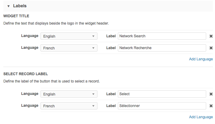
Labels
Define the labels for each language in your search widget.
- Widget Title - The title on both the main search page and the search results page. By default, the title is Network Search. It can be a maximum of 80 characters.
- Select Record Label - The label for the button beside each search result. By default, the button is called Select. The label can be a maximum of 15 characters.
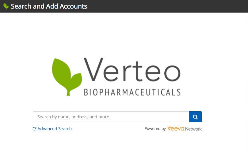
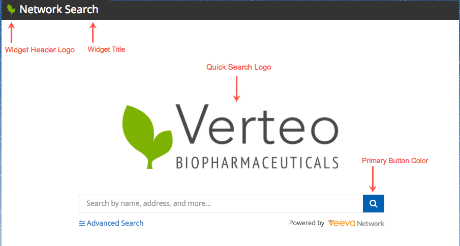
Example 1 - Quick search page
On the main search page, both logos, the widget title label, and the primary button color are used.
In this example, the Verteo corporate logo has been uploaded as the Quick Search Logo. The widget title bar includes the Widget Title label (Network Search) and the Widget Header Logo (small Verteo logo).
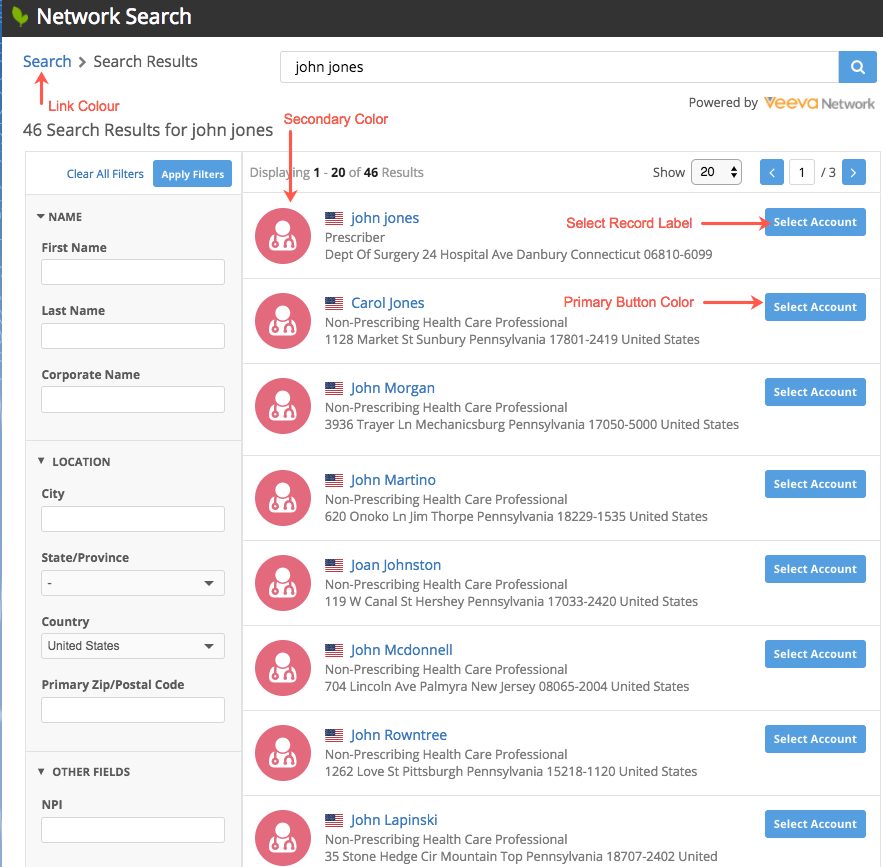
Example 2 - Search results page
On the search results page, the colors, labels, and small logo are used.
In this example, the Primary Button Color and the Secondary Color have been changed from the default colors and the Select Record Label has been changed to Select Account. The widget title bar includes the Widget Title label (Network Search) and the Widget Header Logo (Veeva logo); the same as the main search page.
Saving changes
The widget configuration is complete. Save your changes.
Data components
If you want data components to display so users can access report data or external information about the record in the widget, add the widget to the data component configuration (Widgets & Portal > Data Components).
For details, see Data components.
| < Search widget | Step 2: Embed the search widget > |